top of page


SurgeCore
Energy
THE GOAL
An energy drink that stands apart from the typical "overloaded" market-focused on clean natural enery using real and natural ingredients. The goal-to build something fresh, intentional and trustworthy, while still delivering the visual impact expected from an energy drink on the shelf.
THE APPROACH
A visual system that balances energy with clarity and highlighting ingredients rather than hide them. Packaging was built for production in mind, ensuring art wraps cleanly and stays consistent across flavor and stays consistent across multiple flavors without needing to be reworked.
THE OUTCOME
An brand that stands apart from the typical "overloaded" market-focused on clean natural enery using real and natural ingredients. The goal-to build something fresh, intentional and trustworthy, while still delivering the visual impact expected from an energy drink on the shelf.
Branding

TYPOGRAPHY

ICONOGRAPHY


Design to extend beyond branding into marketing and campaign applications. See Social-Scope Page for real world applications.

La Creche Early
Childhood Centers
THE GOAL
Rework the existing La Creche logo into a cleaner, more cohesive brand that better reflects the environment it represents—warm, trustworthy, and easy for parents to connect with—while making sure it holds up across real-world applications like signage, apparel, and communication materials.
THE APPROACH
Focused on eye catching color palettes, friendly typography, and simple, recognizable iconography to create a calming visual language. The system was designed to be highly legible and adaptable across both print and digital applications, ensuring clarity for parents and consistency across all touchpoints.
THE OUTCOME
A cohesive brand that builds trust at a glance—scaling seamlessly across signage, apparel, and marketing materials while maintaining a welcoming and consistent presence.
Original Branding
Re-Brand


ICONOGRAPHY

VARATIONS OF LOGO


TYPOGRAPHY


Design to extend beyond branding into marketing and campaign applications. See Social-Scope Page for real world applications.

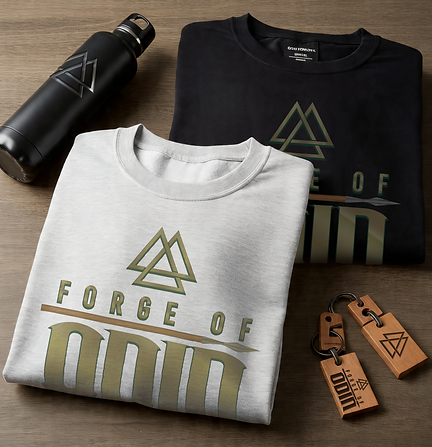
Forge of Odin
THE GOAL
Create a bold, Marvel-inspired logo for a 16-year-old client that captures the high-energy, heroic style he was drawn to—while translating that vision into a clean, production-ready design that works in real-world applications like apparel and promotional use.
THE APPROACH
Leveraged strong typography, sharp iconography, and a high-contrast color palette to create a commanding visual identity. The system was designed to hold its impact across different materials, from apparel to digital graphics, without losing clarity or strength.
THE OUTCOME
A high-impact brand that translates seamlessly across products—built for consistency, recognition, and scalability across both physical and digital applications.
Branding

LOGOS


ICONOGRAPHY


TYPOGRAPHY


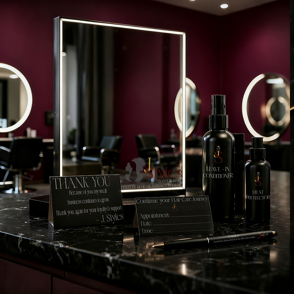
J. Styles
Salon
J. Styles
Salon
THE GOAL
Create a refined, modern brand identity for a salon that feels elevated and professional while remaining approachable for everyday clients.
THE APPROACH
Used clean typography, minimal layouts, and a controlled color palette to create a polished and cohesive visual system that translates seamlessly across digital and in-store materials.
THE OUTCOME
A sleek, scalable brand that maintains consistency across social content, client touchpoints, and marketing materials—supporting both the client experience and ongoing promotion.
Branding

LOGOS


ICONOGRAPHY


TYPOGRAPHY


Black Regal Travel Group
THE GOAL
Build a bold, luxury travel brand that feels aspirational and high-end—positioning itself as a premium service while remaining versatile across digital and print platforms.
THE APPROACH
Combined strong typography with a rich, high-contrast palette to create a sense of sophistication and confidence. The system was designed to scale across campaigns, social content, and branded materials.
THE OUTCOME
A cohesive, high-end brand presence that communicates confidence and exclusivity—built to maintain consistency across all touchpoints while elevating the overall brand experience.
Branding

LOGOS


ICONOGRAPHY


TYPOGRAPHY


bottom of page